CUADERNO LUNAS | SER E ESENCIAL
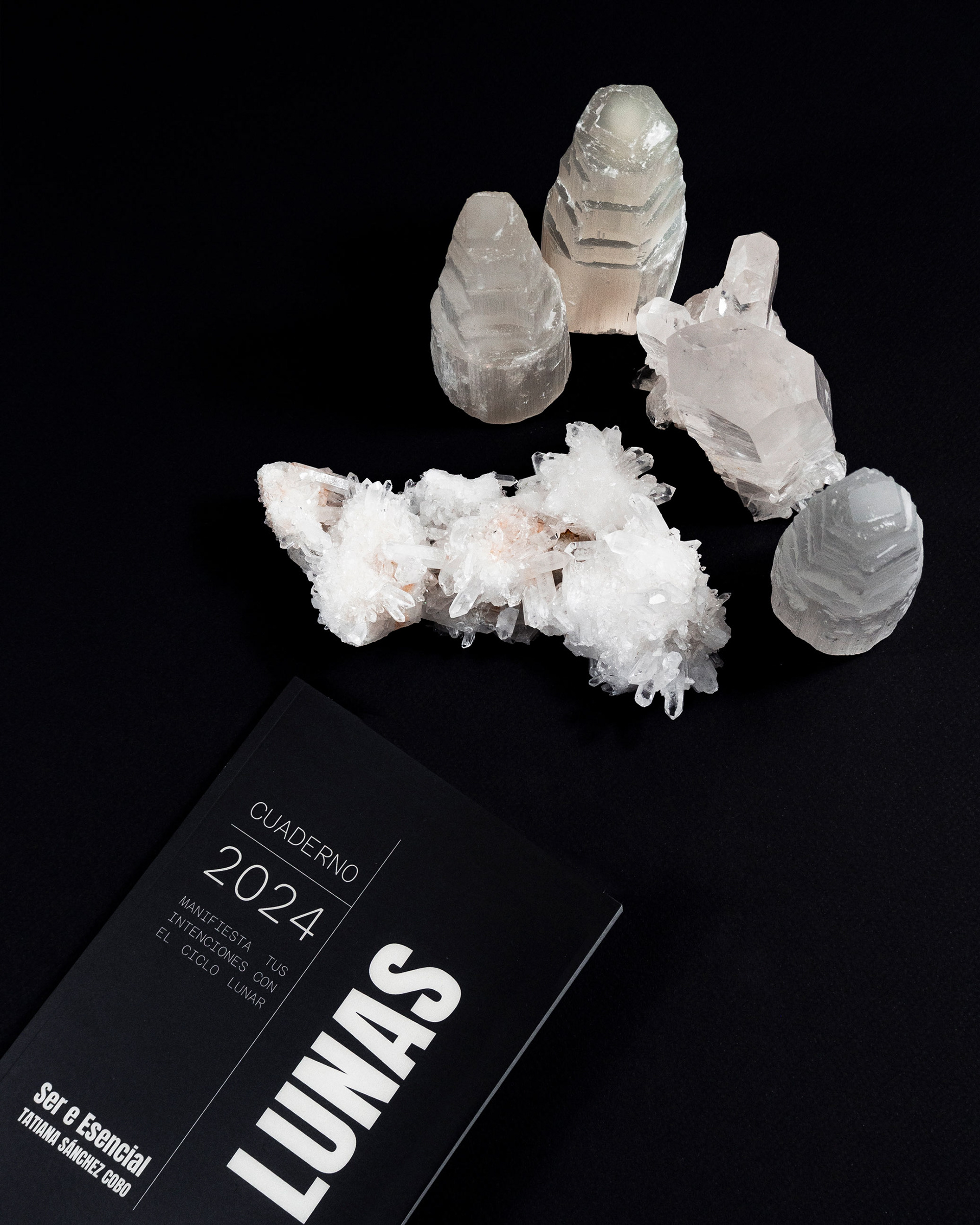
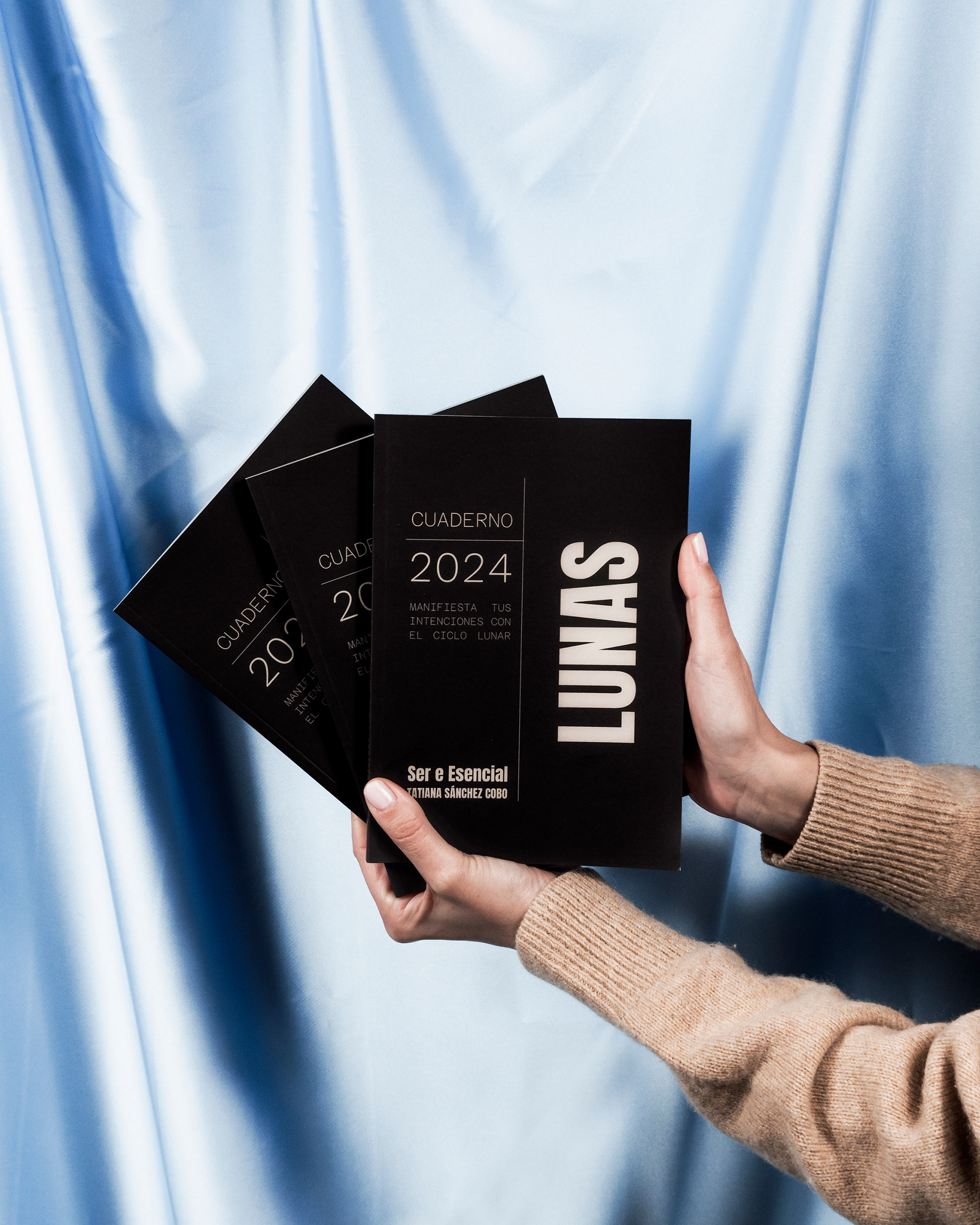
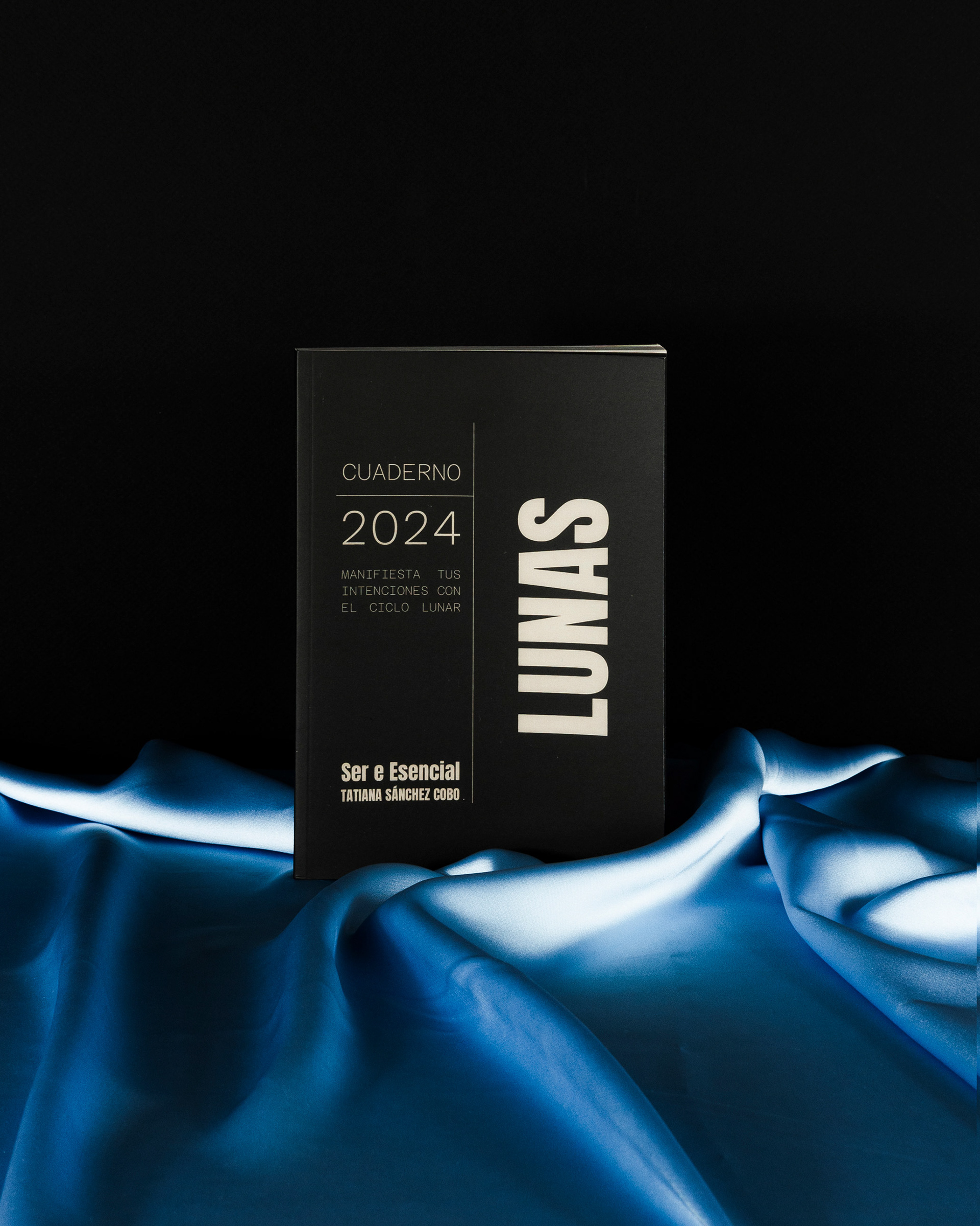
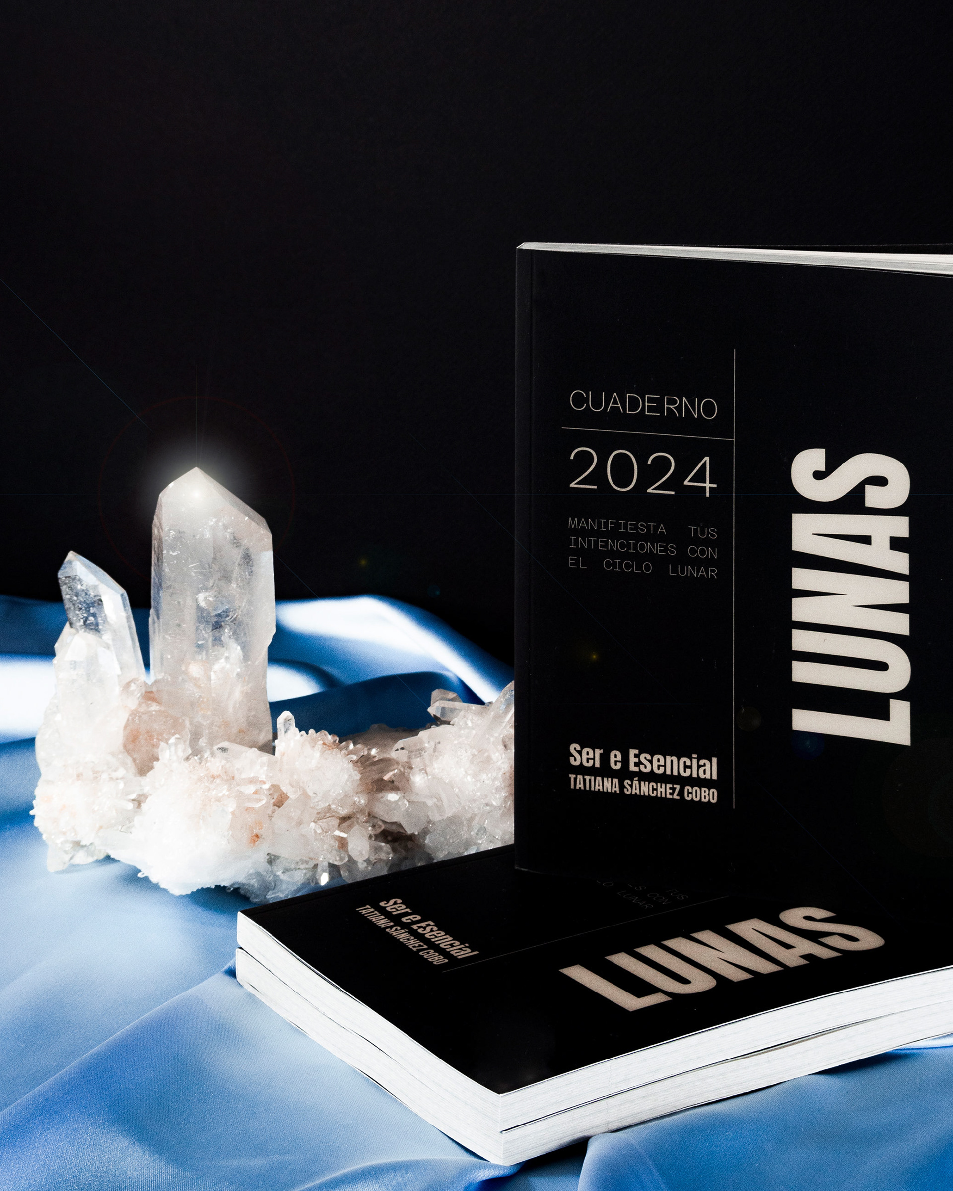
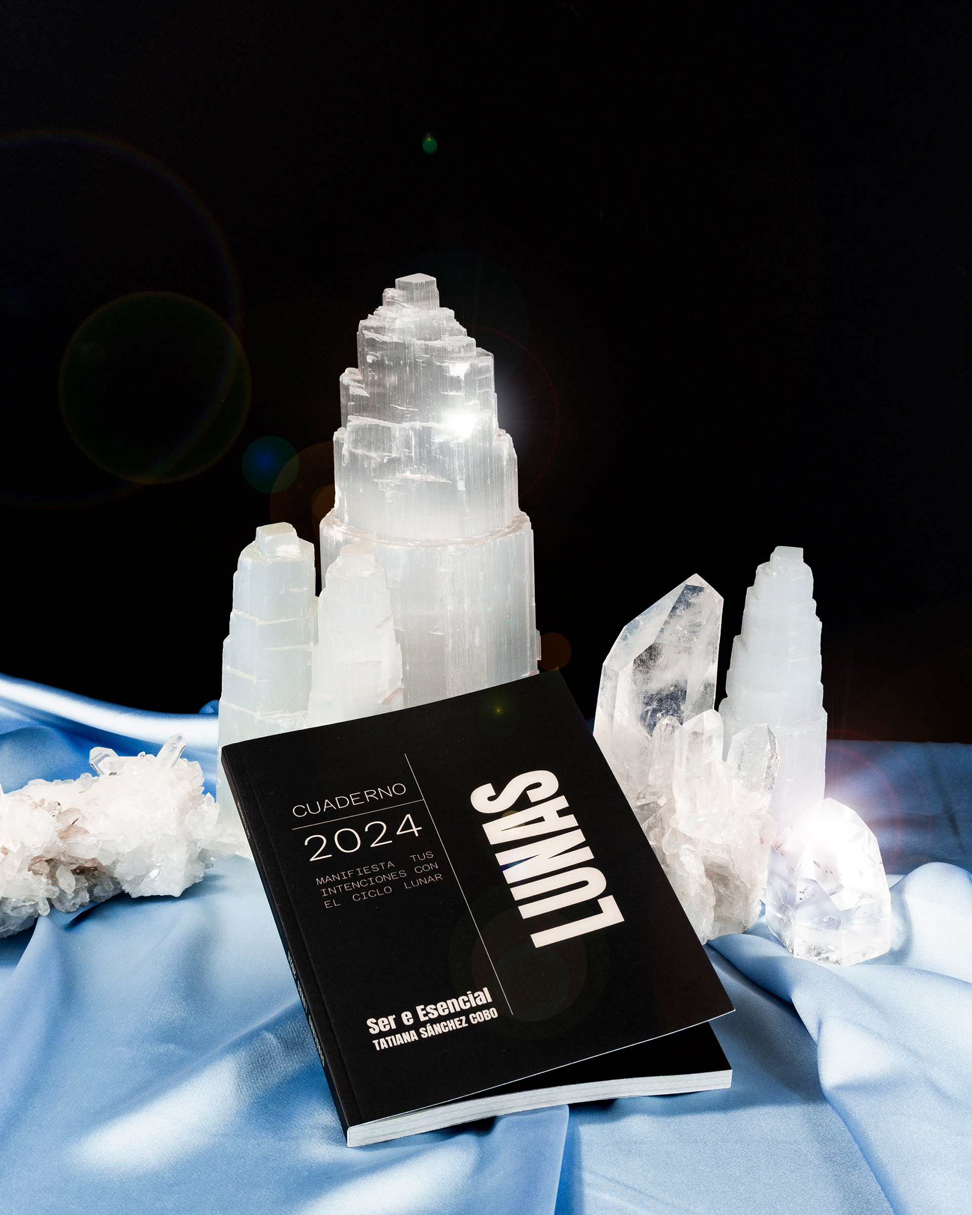
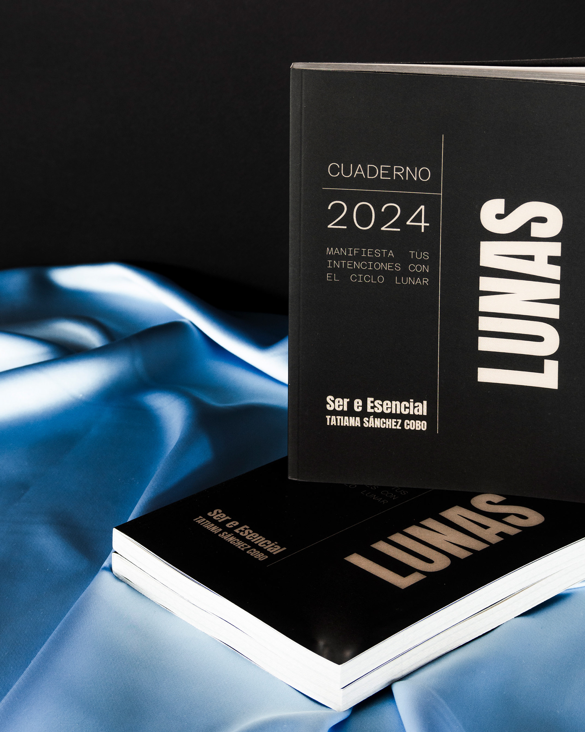
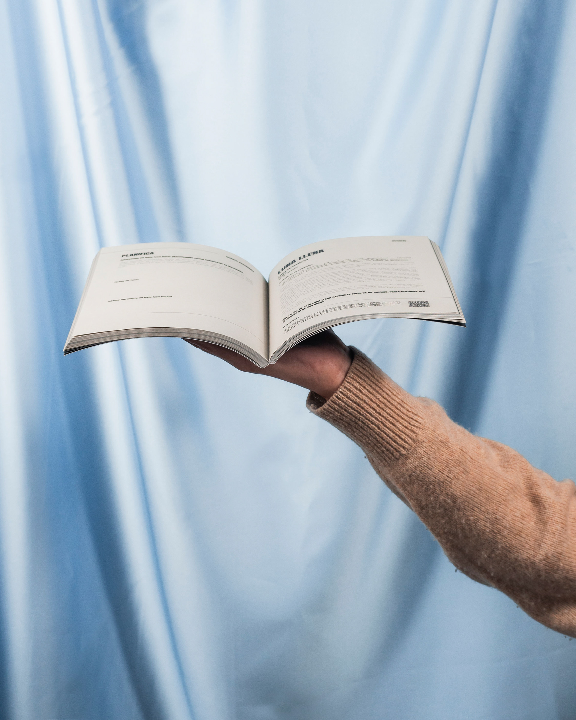
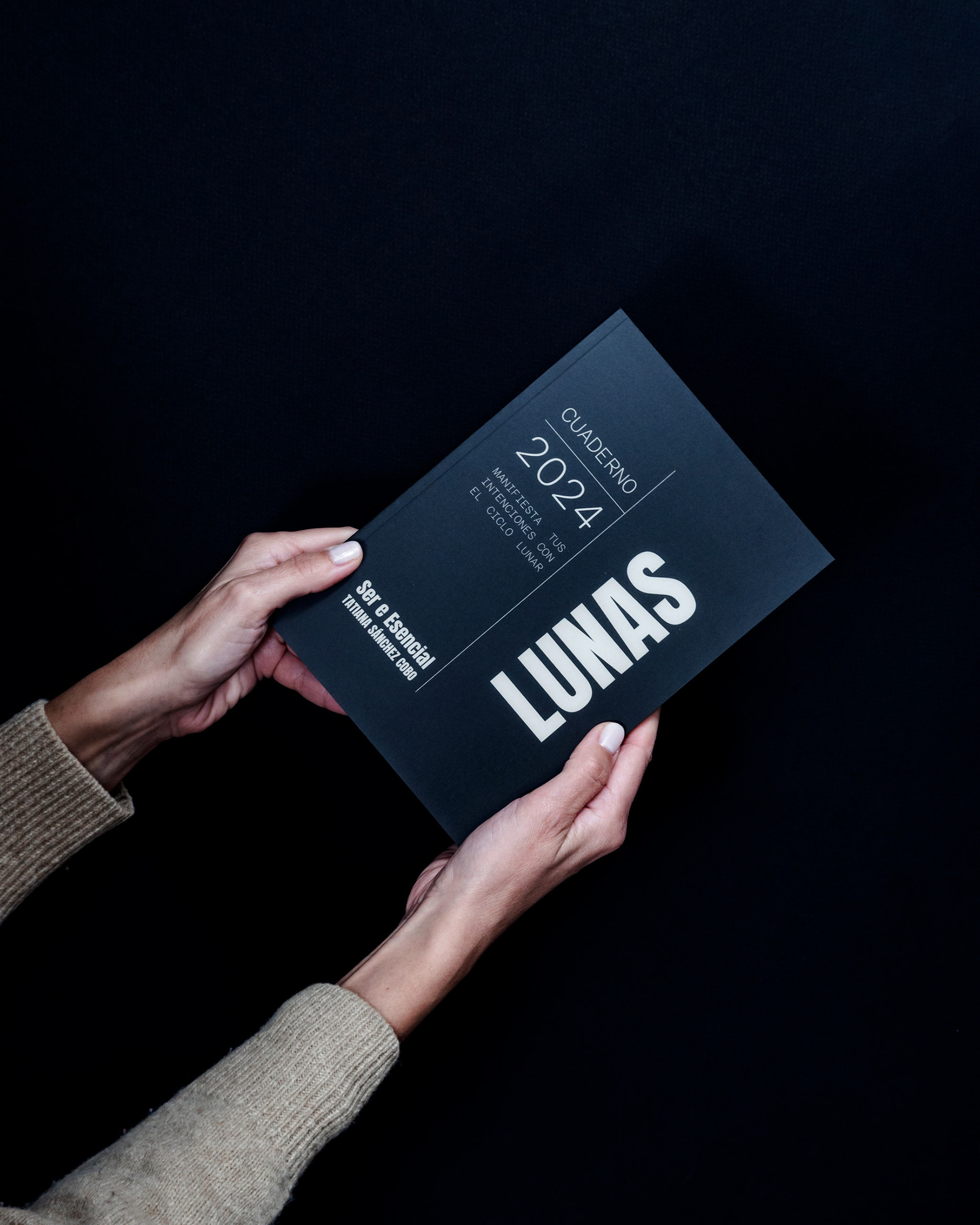
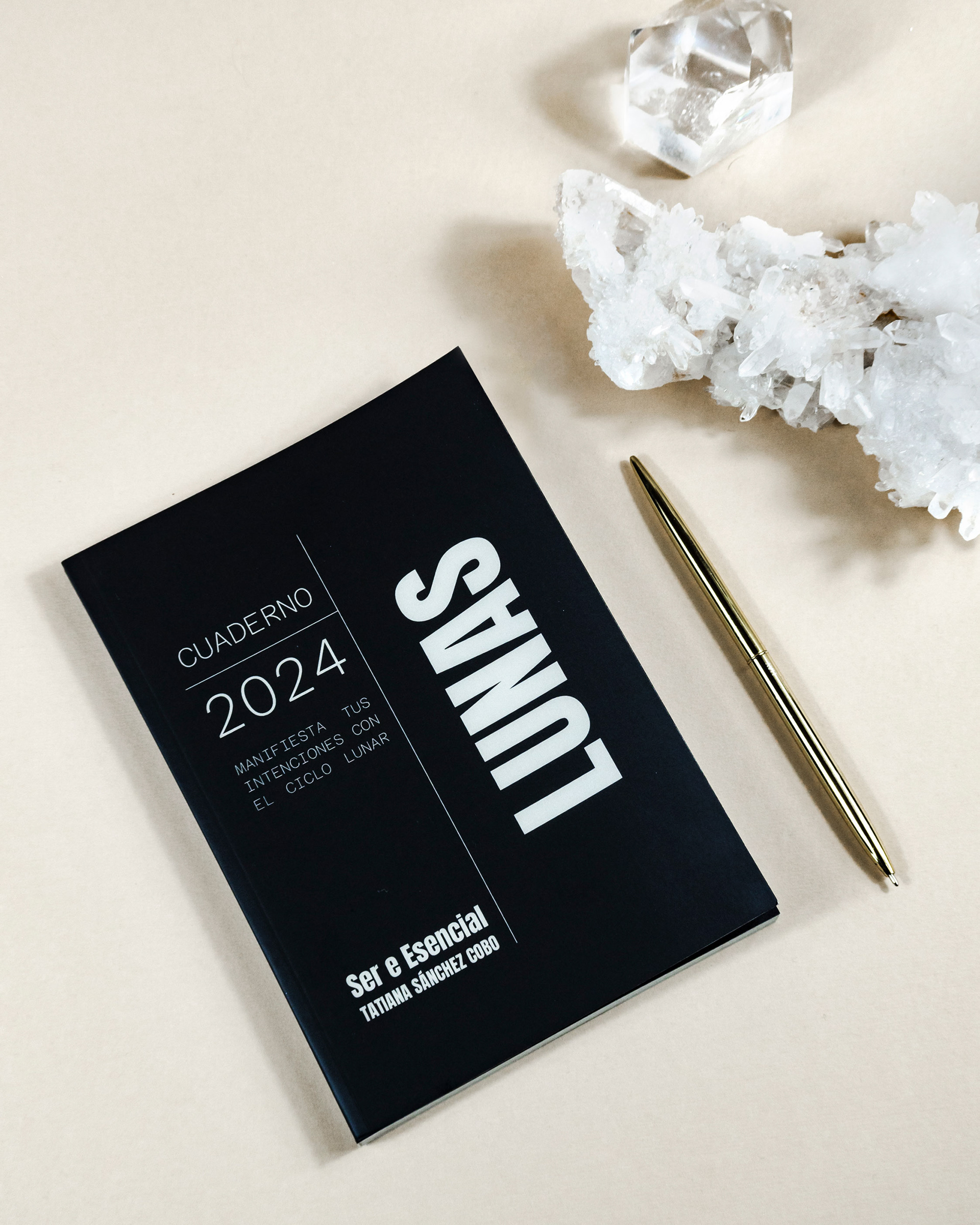
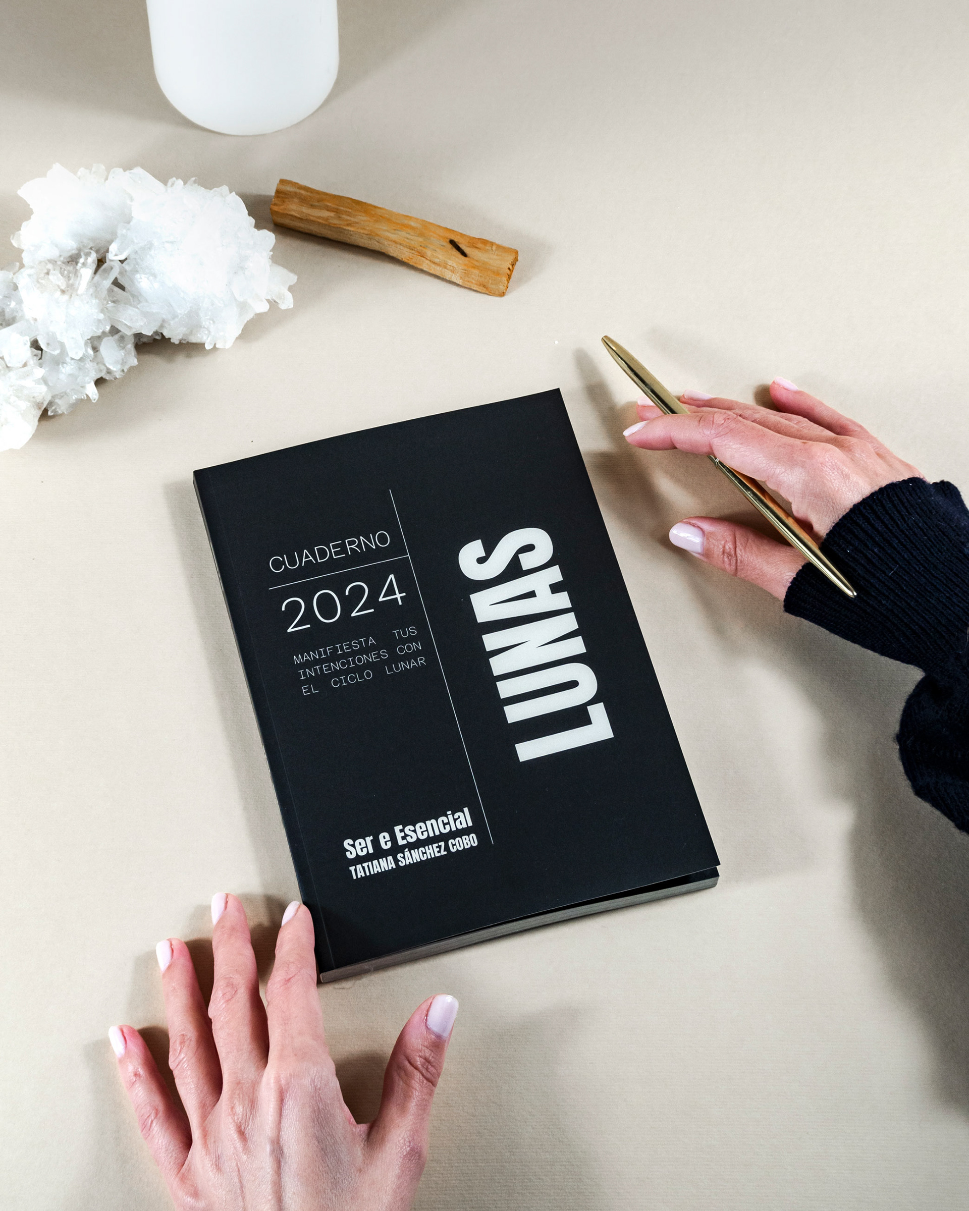
Creative direction & Set Design, Product & Still life Photography & Retouching: Flor Blázquez. _ "Ser e Esencial" is an astrology brand. Through its Moon Journals 2024, it aids self-discovery through astrological journaling, providing foundations to understand what is happening in the sky as well as within ourselves. The creative direction is based on the brand's colors: black, off-white, and blue, enhancing the contrast in its journals. The art direction has three parts: 1* A visual and conceptual direction of the product and its relationship with the moon, hence the choice of mineral stones such as selenite and white quartz. These stones were chosen for their translucency, allowing light to pass through, symbolizing the reflection of the sun on the moon. Additionally, selenite is the stone of the moon, establishing a crucial connection. 2* The act of journaling and meditations with the notebook, using a base of off-white and incorporating ritual elements like candles, stones, and palo santo. 3* A more simplistic yet aesthetic and eye-catching concept, with a blue background and the notebooks creating a visual play. A black background is added to emphasize the power of the notebook. These design choices aim to convey the essence of "Ser e Esencial" consistently and attractively. Made in Spain. All images & content © January, 2024
